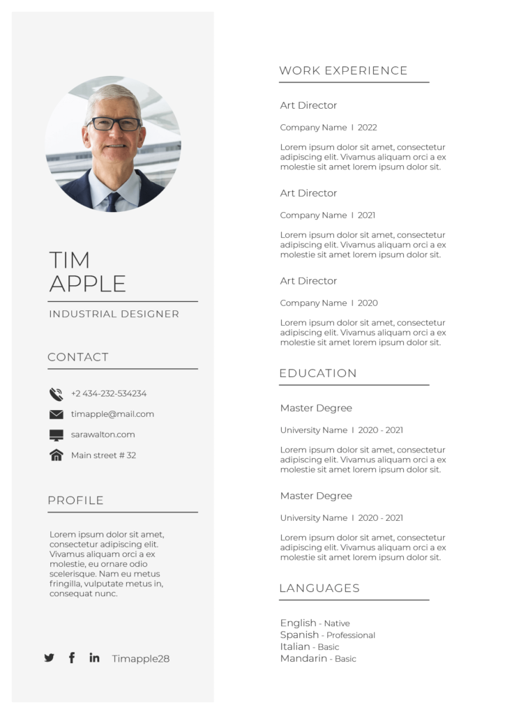
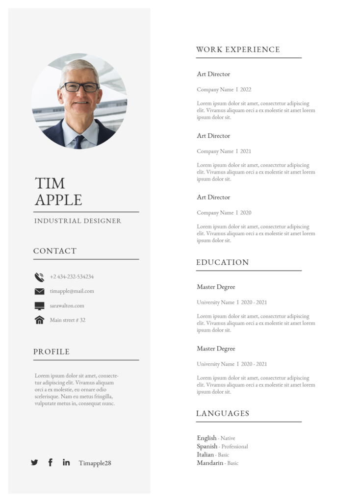
Wondering what is the best font for resume? The short answer is choose font that is simple and easy to read.
Your font choice on a resume can greatly impact its visual appeal, readability, and overall professionalism.
With many options available, it can be challenging to determine the best font for your resume. In this article, I will highlight top fonts and provide tips for creating a standout resume that helps you get hired.
Sans Serif Font
A sans-serif font is one of a best font for resume. It is a type of font that does not have small decorative lines or flourishes at the end of its characters.
It is great font to use if you want your resume to look clean and modern which can convey professionalism and clarity.
1. Poppins

Download Poppins font here.
2. Montserrat

Download Montserrat font here.
3. Open Sans

Download Montserrat font here.
4. Lato

Download Lato font here.
5. Roboto

Download Roboto font here.
6. Gill Sans

7. Plus Jakarta Sans

Download Plus Jakarta Sans font here.
8. PT Sans

Download Plus PT Sans font here.
Serif Font
A serif font is also one of the best font to use for resume. It is a type of font that has small decorative lines or flourishes at the end of its characters. If you want to make it easier to remember, serif font are font that have “legs”
They are often associated with traditional or classic design and can give a sense of professionalism and sophistication.
9. Recoleta

Download Plus Recoleta font here.
10. EB Garamond

The font size EB Garamond font is a bit smaller than usual so you might want to use 13-14pt on the font size. Download EB Garamond font here.
11. Georgia

12. Lora

Download Lora font here.
13. Baskerville

Download Baskerville font here.
14. Times New Roman

15. Vollkorn

Download Vollkorn font here.
Best Font Size For Resume
The best font size for paragraph is around 11 – 12 pt and the best for headings is around 13 – 14 pt. Using a font size smaller than 10 points can make your resume difficult to read, while using a font size larger than 12 points can make it look unprofessional and take up too much space. Nobody want to read 3 pages of resume.
Best Line Spacing For A Resume
The best line spacing for a resume is typically 1.15 or 1.5 so it is comfortable for hiring manager to read.
Best Paper Size For Resume
In general, the best paper size for a resume is 8.5 x 11 inches, which is the standard paper size in the United States. However if you are applying a job in Europe, it will be appropriate to use A4 paper (210 x 297 mm) on your resume.
Worst Font To Use On Your Resume
You might want to avoid any fancy font that is hard to read or look unprofessional such as comic sans or papyrus. You might want to avoid script writing font as well as it is hard to read on a paragraph.
Conclusion
Good luck in your job hunt. If you ever looking for a job in our company, feel free to drop your resume.
