Challenge
Founded in 1980s Leobroco is a family-owned tax and accounting business.
As they planned to adopt cloud computing services which appeal to the younger business owner, we are given this challenge to redesign their old corporate identity.
One of the challenges for this project is to decide which type of logo that suits Leobroco future business nature and the art direction of Leobroco brand identity.

Solution
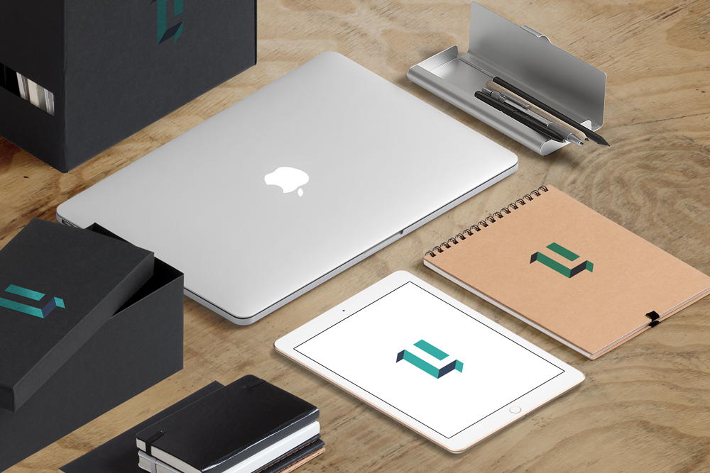
Through the brand strategy process that we gone through with Leobroco, we decided we need a visual personality that appeals to younger business owner and an icon is definitely needed as part of the logo, a proper visual brand consistency, and a new color theme for this visual rebranding.
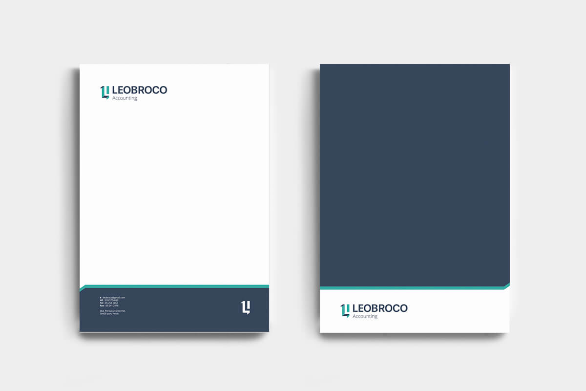
Leobroco Primary Logo
Leobroco Secondary Logo
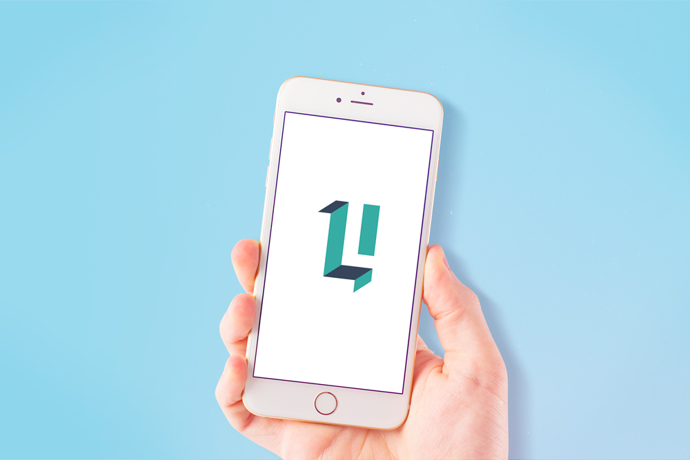
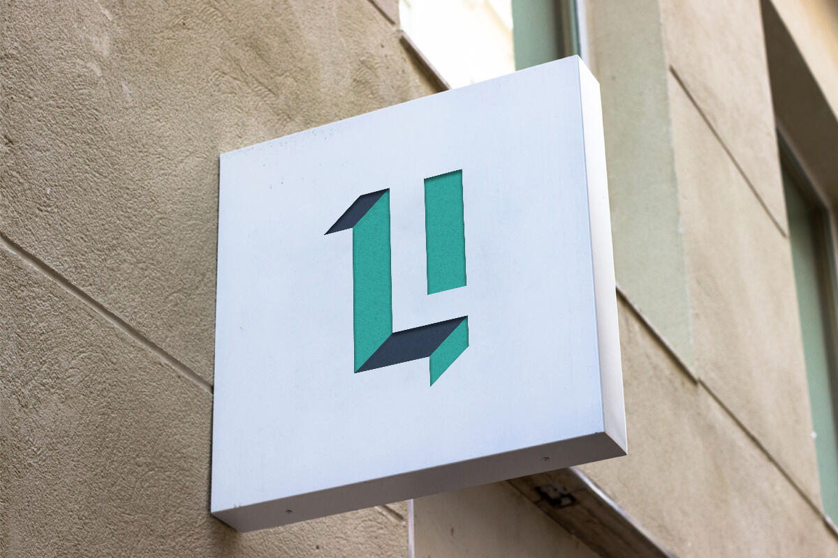
This icon can be later use as secondary logo for small spaces digital implementation such as social media profile picture or apps icon.

How many "L" can you spot in this icon?
With two hidden “L” in this icon that suggest the connection and effort of the brothers that established this company. As Leobroco stands for “Leong Brothers Company”, we think we should embrace Leobroco history as part of this logo as well.

Check out this blog post : The Secret of Branding For Small Business That You Must Know Right Now
Get in touch with us
Are you ready to create a proper visual branding for your business?
Email us at info@brandmoss.com
+60102193769 (Available on WhatsApp)